Case study
Tazamart: Building an Online Grocery App for Life On the Go
Online Grocery App for Arpatech
Client: Arpatech · Role: Mobile engineer — grocery commerce UX, catalog, and checkout · Timeline: Design through store release for Arpatech · Platform: iOS & Android · Framework: Native iOS (Swift / Objective-C) + e-commerce backend · Category: E-Commerce / Grocery Delivery
Speed
Primary design north star
Arpatech
Client
iOS + Android
Shopper platforms
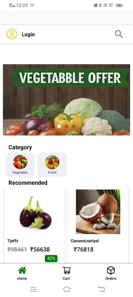
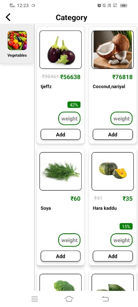
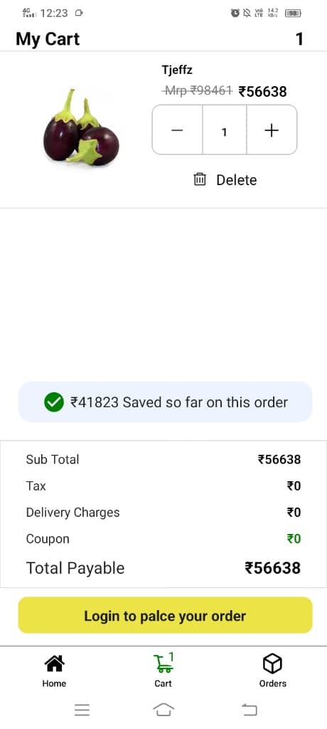
Magazine tour — home with offers & recommended, category browse with add-to-cart, and cart with savings + totals.
Overview
Every design and technical decision had to be judged against one question: does this make grocery ordering faster, or slower?
Grocery shopping is the one errand nobody has extra time for. It's repetitive, it's usually done under time pressure, and it's the kind of task people are actively looking to remove from their day rather than spend more time on.
Tazamart was built for Arpatech to do exactly that — an online grocery app designed around speed and simplicity, so ordering groceries takes minutes instead of a trip to the store. The focus wasn't on reinventing grocery shopping; it was on stripping out every unnecessary step between "I need milk and bread" and the order actually being placed.
The problem
Grocery apps are a crowded space, but a lot of them fail at the one thing that actually matters for this category: speed of use. Arpatech needed Tazamart to solve the actual use case — "on the go."
- Browsing large grocery catalogs on a small screen often turned into a slow scroll through irrelevant categories
- Repeat shoppers were forced to search for the same items every time, with no fast way to reorder a regular list
- Checkout flows with too many steps caused cart abandonment — especially for time-pressed midday orders
- Delivery timing was often vague ("today" or "tomorrow") instead of a clear window users could plan around
Designing for Speed First
Search as the primary entry point
A fast, prominent search bar — and clear category rails — beat burying staples under multiple taps. Home surfaces promotions, categories, and recommended products without a long path to browse.
Respect repetitive shopping
Grocery orders are largely the same milk, eggs, and weekly staples. One-tap reordering from prior purchases matters more than treating every visit like a brand-new discovery trip.
Checkout that stays out of the way
Minimal required fields, a readable cart summary with savings callouts, and a short path from review cart to place order — with delivery windows shown before the final tap, not after.
Architecture & tech stack
Tazamart is a catalog-to-checkout grocery funnel optimized for thumb-speed use. Home combines login entry, search, offer banners, category chips, and a recommended grid. Category browse uses a sticky side rail (e.g. Vegetables) with a product grid — price, weight selector, discount badge, and Add. Cart holds quantity steppers, delete, savings banner, and a payable breakdown before login/place-order. Orders and push notifications close the loop on confirmation → packed → out for delivery → delivered, while stock checks gate cart/checkout so unavailable SKUs fail before payment, not after.
| Category | Tools / tech |
|---|---|
| Mobile framework | Native iOS (Swift / Objective-C) with Android companion experience |
| Commerce backend | E-commerce catalog, cart, and order APIs (WooCommerce-backed store operations) |
| Search & browse | Search-first catalog with category sidebar/filters for produce and staples |
| Payments | Checkout with saved account flows; support for local payment patterns and COD-style completion where needed |
| Order tracking | Orders tab for status from confirmation through delivery |
| Promotions | Home banners, % discounts on product cards, and cart-level savings messaging |
| Analytics | Product and conversion analytics wired for grocery funnels |
| Client | Built for Arpatech |
Key features
01
Fast catalog search & browsing
Search-first browsing with category filters so users find specific grocery items in seconds instead of scrolling an entire catalog.
02
One-tap reordering
Previous orders stay accessible for reorder — recognizing that most grocery shopping is repetitive rather than novel.
03
Simplified checkout
Streamlined cart-to-order with clear totals, savings, and minimal steps between review and place order.
04
Real-time order tracking
Customers track status from confirmation through delivery, cutting "did my order go through?" uncertainty.
05
Delivery time windows
Clear, realistic windows shown upfront so users can plan around the order instead of guessing arrival.
06
Promotions & savings clarity
Offer banners, %-off badges, and a "saved so far" cart message that makes value visible while shopping fast.
Engineering challenges & solutions
Challenge
Keeping catalog search fast as SKU count scaled
Solution
Treat search and category browse as first-class surfaces with indexed lookups rather than naive full-catalog queries — so produce and staples stay near-instant as the assortment grows.
Challenge
Handling stock accuracy in near real time
Solution
Stock status checks in cart and checkout flag unavailable items before final confirmation — avoiding the worse case of discovering a miss after the order is already placed.
Challenge
Keeping checkout genuinely fast, not just visually simple
Solution
Profiled checkout API calls, reduced round trips, and combined validation so perceived speed matched the simplified cart UI.
Challenge
Promotions that don't confuse a hurried shopper
Solution
Keep discount math visible on cards and as a single savings banner in cart — so promotions accelerate decisions instead of forcing users to re-check pricing mid-flow.
Results
- Delivered Tazamart for Arpatech as an on-the-go grocery ordering experience
- Home → category → cart funnel documented for speed-first grocery UX
- Native iOS commerce client over an e-commerce catalog/order backend
- Promotion and savings surfaces designed for quick decision-making, not browsing for sport
What I’d do differently
- I would invest earlier in dedicated search indexing infrastructure before the catalog hits peak SKU count.
- Checkout can still shed fields based on real abandonment data — especially guest vs logged-in paths.
- Weekly grocery list templates deserve earlier priority given how repetitive grocery behavior is.
Frequently Asked Questions
What makes Tazamart different from other grocery delivery apps?
The experience was designed around speed for repeat, time-pressed shoppers — fast search, reorder-friendly history, and a simplified checkout rather than a generic e-commerce flow adapted for groceries.
How does Tazamart keep search fast with a large grocery catalog?
By treating catalog search and category browsing as indexed, first-class surfaces instead of relying purely on slow full-table queries as SKU count grows.
Does Tazamart show real-time delivery tracking?
Yes — customers can track order status from confirmation through delivery, with clearer delivery windows shown before checkout.
Who was Tazamart built for?
Tazamart was developed for Arpatech, targeting everyday grocery shoppers who want a faster, simpler way to order without a full store visit.
Building a grocery or quick-commerce app where speed is the product?
Book a free consultation or message on WhatsApp — bring your catalog size, delivery zones, and the moments shoppers currently abandon cart.
Prefer a quick jump? Start on the ads landing page or return to portfolio.